


Description
About the project
About the project
About the project
Who: The University of Texas at Austin Department of Nuclear and Chemical Engineering
What: TACO Desk
Audience: Texas legislators, policy officials, people curious about Nuclear power
When: May - June 2025
Where: Remote
How: Figma, ZenDesk, HTML, CSS, Handlebars
My role: Lead UX designer and front-end implementer
Results — Visit the site here!

The redesign shifted the TACO Desk website from confusing to engaging:
Q3 had a 50% increase in ticket creation from Q2
The site became a central hub for nuclear information, approachable to students and researchers alike.
Branding consistency increased trust and recognizability, aligning the digital presence with TACO’s mission.
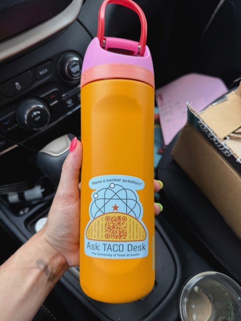
Physical outreach supported the site: QR codes on stickers, pens, and merch now drive traffic directly to the hub.
 |
|
|---|
The project not only improved digital engagement but also extended TACO’s presence into the physical world, connecting curious users to reliable information with a single scan. In my design practice, I believe that making information accessible and digestible is a keystone of my work. I am driven by giving users the tools that they need to thrive in their curiosities.
See the site here!
Results — Visit the site here!
The redesign shifted the TACO Desk website from confusing to engaging:
Q3 had a 50% increase in ticket creation from Q2
The site became a central hub for nuclear information, approachable to students and researchers alike.
Branding consistency increased trust and recognizability, aligning the digital presence with TACO’s mission.
Physical outreach supported the site: QR codes on stickers, pens, and merch now drive traffic directly to the hub.
|
|
|---|
The project not only improved digital engagement but also extended TACO’s presence into the physical world, connecting curious users to reliable information with a single scan. In my design practice, I believe that making information accessible and digestible is a keystone of my work. I am driven by giving users the tools that they need to thrive in their curiosities.
See the site here!